
Late updated: 10 Apr 2025 11:04
Written by: Daniel Harper
Modern Colour Schemes For Kitchen Renovations: Inspiring Trends and Ideas
Embarking on a kitchen remodel can be both exciting and daunting, particularly when choosing the colour scheme. Selecting the right colours can significantly impact the overall feel and aesthetic of the space. Neutral tones, like soft greys and whites, paired with vibrant accents, are becoming increasingly popular in kitchen design as they offer timelessness while providing flexibility for future updates.
In recent years, we’ve seen a shift towards warmer tones and multi-coloured options, moving away from colder greys. Incorporating materials such as bold tiles and natural wood can further elevate the kitchen’s look, offering a perfect synergy between colour and texture. This trend not only adds depth but also creates a homely atmosphere that many seek.
For those planning a kitchen renovation, understanding how to coordinate these elements is key. By integrating classic and modern hues, homeowners can create a space that feels both fresh and welcoming. Whether you're looking for a complete overhaul or a minor update, aligning your materials with your desired colour palette can truly transform your kitchen.
Key Takeaways
- Select timeless neutral tones with vibrant accents.
- Integrate warm tones and diverse materials for depth.
- Coordinate colours and materials for a cohesive kitchen design.
Choosing the Right Colour Scheme for Your Kitchen
Selecting a colour palette for a kitchen remodel can transform the space's atmosphere and functionality. Understanding how colours affect mood and design trends is key to creating an inspired kitchen environment. Let's explore psychological aspects, the popularity of neutrals, and how beige can enhance warmth.
Understanding Colour Psychology in Kitchen Design
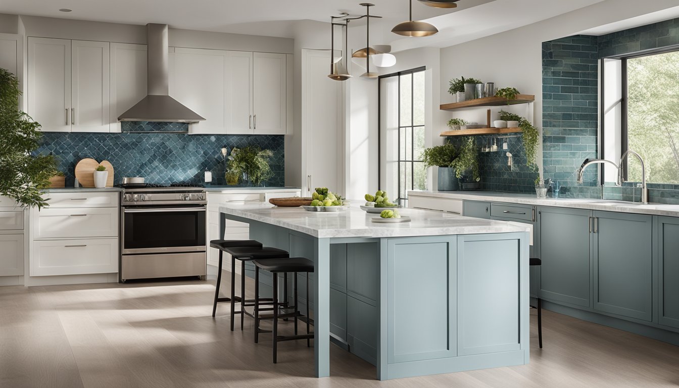
Colour psychology plays a pivotal role in kitchen design. Each hue affects mood and perception distinctly. For instance, blue is often associated with calmness and can be used to create a serene cooking space. Meanwhile, orange and yellow are known for their invigorating qualities, adding energy and warmth. These colours can make the kitchen feel more vibrant and lively.
Our choice of colours must balance aesthetics with functionality. Bold colours may be visually exciting, but neutral tones can make a room feel more spacious and inviting. Colour combinations impact the overall dynamic of the room, influencing everything from lighting to spatial perception. Integrating effective colour schemes enhances the overall comfort and usability of the kitchen.
The Rise of Neutrals and Earth Tones in Modern Kitchens
Neutral and earth tones have surged in popularity within modern kitchen design. Shades like off-white, grey, and taupe provide simplicity and timelessness. They act as a versatile backdrop that complements various kitchen styles and accent colours. Neutrals can be easily integrated with both traditional and contemporary designs.
Earth tones, such as soft browns and greens, are increasingly preferred for their connection to nature and their soothing effect. They introduce a harmonious vibe, which can help create an inviting environment for family gatherings and meals. Utilising these tones in cabinetry, walls, or tiles can bring both sophistication and comfort to any kitchen space.
Integrating Beige for a Warm and Inviting Atmosphere
Beige stands out as an adaptable choice in kitchen renovations, known for its ability to enhance warmth without overwhelming the senses. This colour bridges the gap between stark whites and bold colours, offering a subtle yet elegant backdrop. It pairs well with wooden accents and stainless-steel appliances, complementing both modern and rustic styles.
Incorporating beige in kitchen design enables us to create a cosy atmosphere. It works seamlessly with light colours for a minimalist look or with dark shades for contrasting depth. Its soft neutrality makes it a popular choice for countertops, cabinets, and wall colours, ensuring that the kitchen remains inviting and cohesive.
Material Selection and Colour Coordination

In kitchen design, selecting materials and coordinating colours are vital for creating an aesthetically pleasing space.
Selecting Countertops to Complement Your Colour Palette
When selecting countertops, it's essential to consider the overall kitchen design and existing colour palette. Granite and quartz are popular choices due to their durability and wide range of available shades. If a modern look is desired, one might opt for sleek, solid colours or subtle patterns in neutral tones.
Marble offers a classic charm, with veining that can add a touch of luxury. For a cohesive look, consider coordinating countertop colours with backsplash tiles or floor finishes. Choosing countertops made from recycled materials, like glass or concrete, can add a unique texture and contemporary feel to the kitchen while aligning with a certain aesthetic.
Choosing Kitchen Cabinets That Enhance the Colour Scheme
Cabinet selection plays a crucial role in defining the kitchen's appearance. With kitchen cabinets, we can introduce bolder tones for a striking effect or select muted shades for a more neutral backdrop. High-gloss finishes can lend a modern touch, while matte surfaces often convey a more traditional feel.
We can explore colour contrasts by pairing dark cabinets with lighter countertops, creating depth and visual interest. On the other hand, opting for cabinets in shades that mimic natural wood can provide warmth and a timeless appeal. Open shelving can also be used to showcase colourful dishware, subtly tying colours together across the space.
Frequently Asked Questions

Modern kitchen design often revolves around selecting the right colour schemes to enhance style and functionality. From popular combinations to practical choices for small spaces, colour plays a pivotal role in kitchen aesthetics.
What are the most popular colour combinations for contemporary kitchen renovations?
In contemporary kitchen renovations, neutral tones such as white and grey are frequently paired with bold hues like navy blue or deep green. These combinations provide a sophisticated yet dynamic look. Adding metallic accents can create an additional layer of elegance.
How can one select an ideal colour palette for a small kitchen refurbishment?
For small kitchens, lighter shades such as soft whites, pastels, or light greys help maximise light and space. To add depth, consider integrating a darker accent on cabinets or splashbacks. Choosing a reflective surface can further enhance the space’s openness.
Which colours are currently considered the best choice for kitchen walls?
Soft whites, warm greys, and gentle earth tones are often preferred for kitchen walls, as they offer a versatile backdrop. These colours complement most kitchen fittings and create a bright and welcoming environment.
Can you suggest some modern kitchen cabinet colour schemes with images for inspiration?
Opt for contrasting colour schemes, like pairing dark blue cabinets with white countertops, or choosing muted green tones for a more natural feel. While I can't provide images here, many online platforms exhibit striking examples to visualise these ideas.
What are top kitchen colour schemes consistently rated as the best?
Consistently popular schemes include monochromatic setups using varying shades of a single colour, and two-tone designs that utilise contrasting upper and lower cabinets. Harmonising all elements, such as countertops and flooring, is key to a cohesive look.
How does one effectively incorporate a complementary colour scheme in a kitchen design?
To achieve a complementary colour scheme, select colours opposite each other on the colour wheel. For instance, pairing a warm orange with a cool blue creates a striking contrast. Balance is essential, ensuring colours enhance rather than overpower the space.